Do you want your blog to do more than just get you some retweets?
If you’re wishing your blog was a 24-hour salesman that constantly educates, prospects and closes deals for you, then close Facebook and put your phone in your pocket. This is going to be a masterclass in high conversion blogging.
I don’t blog or write for fun. If I want to have fun, I play video games. If I want to generate revenue, I blog.
I hate the terms “blog” and “blogging,” though. They don’t correctly describe the purpose of what we’re doing. Which leads me into my first lesson of this article…
Stop calling it a blog
 Calling it a blog suggests you’re interested in readers, comments and social shares. It suggests you’re writing for the sake of having an online diary. Instead, you need to think of it as a strategically designed content marketing environment.
I know…
That’s a mouthful.
I don’t have a fun cutesy name for it, though.
What I’m going to describe here is much different from a normal blog. Every element of every page is carefully constructed to achieve a specific measured result. For example, your sidebar is going to stop being a widget wastebasket. Instead, your sidebar is going to become as critical as a soldier’s sidearm when his rifle has just run out of bullets in the heat of battle. But before I explain where to put your sidebar, whether you should have one and what should be on it, let me explain how I came upon my methods.
From 2 to 25 percent conversion rate?
I don’t know about you, but I run a small bootstrapped business. I don’t have lots of employees, nor am I backed by VC money, so when I do something online, it needs to count. Not that it doesn’t count if you are VC-backed or you work for a company with 200 employees; those companies have more wiggle room, though. They can recover from mistakes easier and faster.
“Blogging” is no different. I don’t have the time or money to waste.
The first time I looked at my Google Analytics after a few weeks of “blogging,” I wanted to punch someone. My sidebar opt-in box had a 2 percent conversion rate, and after weeks of work I had a combined 23 shares across six articles. That’s less than four apiece. I know. Pathetic.
The word unacceptable doesn’t seem strong enough.
Prior to “blogging” I had always written sales pages. My roots are in direct response marketing and selling info products (ebooks, courses, DVDs). When I sell info products I use sales letters, and as a direct response marketer I track EV-ERY-THING.
I didn’t know any better, so I started treating my “blog” as I would a sales letter. I started optimizing every pixel on the page for better performance. I started driving ads to my pages and I started using the same split-testing tactics on my blog posts as I use on salesletters (buying ads and split-testing is just what we direct response guys do).
When I had gone from 2 percent conversion rate to 25 percent conversion rate, received hundreds of shares per article, and when I was landing six-figure deals directly from articles I’d written — I figured I’d finished. In that time, I had spent $3,000 per month for a little less than a year buying Facebook ad traffic to my articles.
That’s where the $30K figure comes from. I spent that money on traffic while I tested every possible thing I could think of to test.
4 things spending $30K taught me
Obviously, there are lots of micro-adjustments that I made during the course of a year. However, there were four main things that really moved the needle.
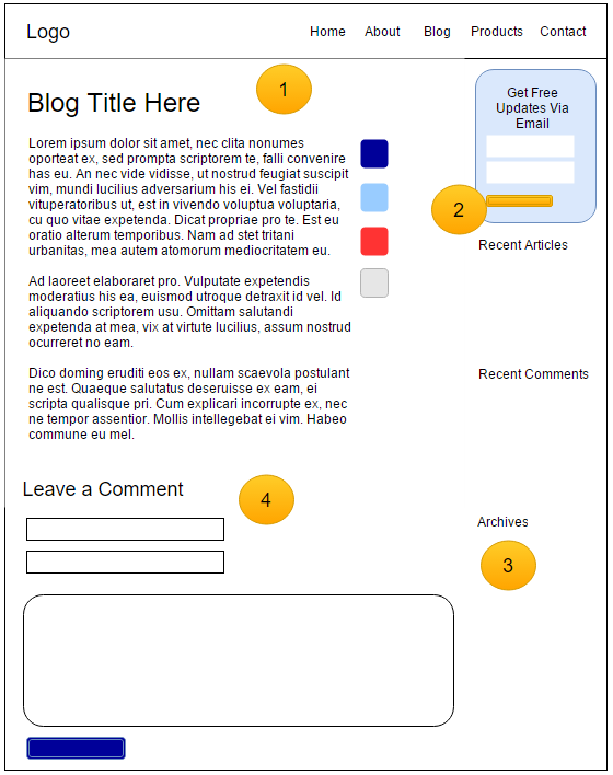
The image below shows a standard blog layout. You’ve probably seen 100 blogs with this same layout and most WP themes come with this layout as the default. I’ve highlighted the four main areas of improvement with orange circles.

#1: Take advantage of premium screen real estate
When writing sales letters I focus a lot on the section “above the fold.” For copywriters, that’s the top of the page, headline and first paragraph — commonly, the parts visible when the page is folded and stuffed into an envelope. For Web designers, the “fold” is considered the spot at which someone has to scroll down to see more.
Optimizing this above-the-fold area to make the most of the screen real estate had the biggest impact of all the things I tested. Switching my opt-in box from the sidebar on the right to the header area just below my logo and navigation was a HUGE bump in visitor-to-leads conversion. Just moving our same opt-in offer from the sidebar to the header I went from 2 percent of visitors becoming subscribers to 5 percent.
Then I changed the offer from “get free updates via email” to an actual item they’d receive immediately. What happened? I doubled my conversions. I was now converting 10 percent of my visitors into leads.
Better, but in my world, converting just 10 percent of your visitors to leads is difficult to afford and weak. I was used to 25+ percent conversions from squeeze pages, so I wasn’t impressed with 10 percent.
#2: Move your sidebar to the left
To get more ideas for improving my own site, I started researching what the big dogs do — the Amazons, Facebooks and Walmarts. They have way more resources than I do for testing optimum performance, so I wanted to borrow from their experience.
About this time a friend of mine, Internet marketing pro Michelle MacPhearson, mentioned that she had recently tested her sidebar on the left side of her site with good results. I also noticed that all of the major sites put their navigation on the left side. Think of your Facebook newsfeed. Think of Amazon. You almost always interact with the left-hand side of the screen.
When I dug deeper into this, it was confirmed by the Nielsen Norman Group. This prestigious media research firm conducted a study that proved Web visitors look at the left side of the screen more than they do the right.
![]()
In their study, they outfitted people with special goggles that tracked their eye movement when they visited different types of Web pages. They found that the average user views Web pages in an F pattern. Starting with the top left, coming down, and a little over to the right.
When I moved my sidebar to the left, I got another 3 percent of my traffic to take my offers. Before that it was less than 1 percent. It’s not fair to say that only moving my sidebar from right to left caused this big bump, though — which brings me to #3.
#3: Use your sidebar strategically
Like most people, my sidebar had recent articles, comments, archives and tons of other crap. It was a place where I just stuffed whatever widgets looked good.
When I looked at it through the lens of a direct response guy, I learned that not a single person clicked on archives — and that took up a large portion of my sidebar. Some people clicked on recent articles, but that wasn’t really what I wanted them to click on.
As I said at the beginning of this article, I consider my blog a strategically designed content marketing environment. My first priority is creating and posting content that attracts the right visitors and that the right visitors will enjoy. Because if they don’t enjoy what you create, they won’t convert, no matter what conversion tricks you pull.
My second priority is that I convert visitors into leads. Coming in at a distant third is that they visit multiple pages.
Since visiting multiple pages was not a high priority, I removed everything from my sidebar that tried to get them to visit multiple pages. I replaced it with a call to act on one of my “lead magnets” because again, my highest priority was converting visitors to leads.
Optimizing my sidebar combined with moving it to the left is what I attribute the 300 percent increase in performance. Today, my sidebar only has three things in it: a call to action, a way to become a fan and a search box.
#4: Replace comments with a call to action
If your blog is a social hub, you can keep the comments. For me, I keep my social hub on social media. To squeeze out more performance from my content pieces, I replaced the comments section with another call to action. This time it was the same offer as in my header.
The header and bottom of post areas are highlighted, so they don’t blend in with the content. This helps them to convert a little better than when it just looked like any other part of the page.
You can still keep your comments section, if you want — just have your Web guy insert a call to action box right above the comments but right below the content. Hubspot does theirs this way.
If you have the ability to customize that offer below the post for each specific article, do it. When I’ve done that my conversion rate would spike to as high as 85 percent on that one article. However, doing that for every article can be very tedious, so I only do it on my most popular posts.
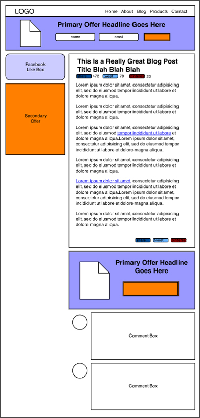
Now that I’ve explained the four biggest changes, here’s what the new layout should look like:

What markets will this work in?
Nothing I’ve mentioned here is market-specific. I’ve helped clients make these changes in markets ranging from fitness and finance to permaculture design. It’s all based on basic human psychology and average user-interaction patterns.
These changes aren’t difficult to make, either. There are many themes that can do this, including the one I use on all eight of my sites, FocusBlog by ThriveThemes. Any Wordpress-savvy Web designer can make these changes, too.


