Knowing what content works best for your goals can be just as important as knowing what content to use. For example, we know the written word can tell a story and draw a reader in, but did you also know articles with images get 94% more views? Consider the role of an infographic (or two!) in your content marketing plan to ensure your articles get all the buzz they deserve.
We’re here to help you choose the most appropriate content types to fulfill your content strategy. Learn simple definitions, get clarity on formats, and see plenty of infographic examples so you start with a solid foundation.

What is an Infographic?
As a hybrid of “information” and “graphics,” the infographic is a visual communication device that tells a complex story graphically using designs, images, and a minimal amount of copy.
Infographics are typically created as a PDF or photo file, so viewers can see and share them easily across different platforms, including mobile. Since infographics rely so much on visuals, they often incorporate themes and branding elements of the company or offerings they promote. This way, readers can quickly associate an infographic with the entity that created it or at least associate it with the entity at a later date.
Why Use Infographics?
Infographics serve a unique purpose: to communicate important information quickly and with maximum impact. A great infographic doesn’t just communicate a complex concept uniquely; it should also make you want to share it with others.
When a consumer finds an interesting infographic, tweets it, and adds it to their blog or posts it on their Facebook group, they are hoping to help others with just the click of a button. This may be why, according to HubSpot, infographics are the fourth most popular form of content marketing. After all, they’re creative and jam-packed with practical info.
Infographics also make great use of color. Why is this important? Xerox recently shared research regarding color’s role in helping people learn. When used in information materials, color:
- Increases comprehension by up to 73%
- Increases retention and learning by up to 78%
- Helps sell up to 80% more
- Boosts brand recognition by up to 80%
While there’s no good reason to use a black-and-white infographic, this data reinforces how important color can be in getting your message across. It also proves that you should spend as much on your infographic design stage as the writing stage. Getting color wrong can undo all of those significant advantages.

How an Infographic is Created
For as simple as an infographic appears, there’s quite a bit that goes on behind the scenes to make it happen. Infographics are typically outlined by a creative director or writer and then written up as text in the simplest form possible to convey the message. After that, graphic designers or artists take the text and make a rough visual layout with simple illustrations that make the text pop and easy to digest.
In the final stages of revision, you should fine-tune graphics and incorporate elements from the brand style guide so that it feels like the other assets the company has produced. Tweak text or images to fit the page, add emphasis, or direct the viewer to the call to action (CTA) that’s usually positioned at the bottom of the infographic.
If any data or sources were used to create the infographic, these are listed as citations at the bottom of the infographic, as well. It’s important to give credit where credit is due.
It may begin on a datasheet, but thanks to the work of a writer and graphic designer, a compelling flow can be created that keeps eyeballs affixed as they move down the page.
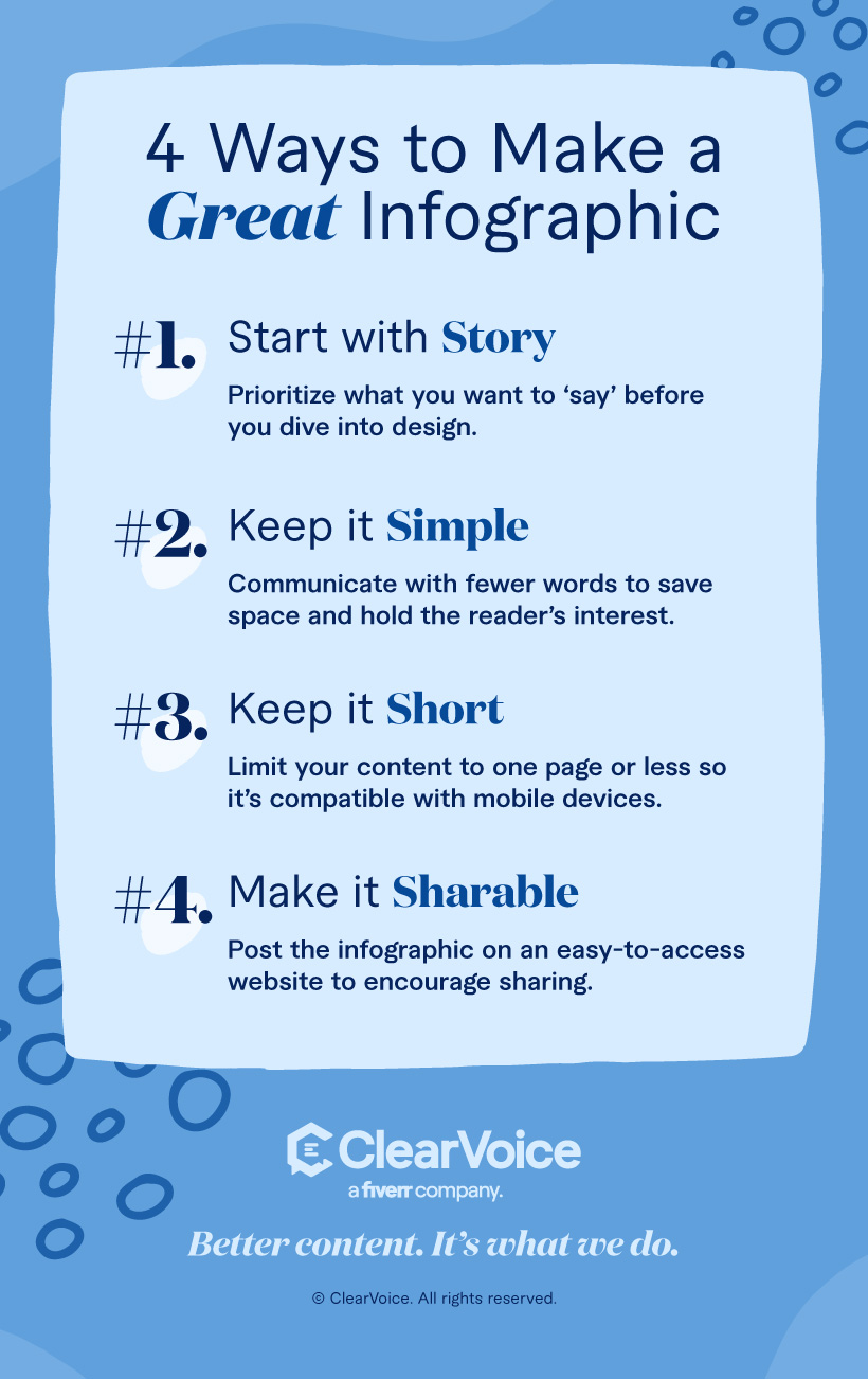
4 Ways to Make a Great Infographic
Infographics have their distinctive benefits, so it’s important to remember them when putting one together. When infographics try to become something else, like a text-heavy document that resembles a blog post, it doesn’t create the same effective magic that infographics uniquely deliver.
While there will be some nuance in your infographic process, there are some general guidelines for getting started. These work for any industry:
1. Begin with the story
You may have an illustration or graphic template you love, but that’s not the starting point for an effective infographic. The information is what people come for, so prioritize what the infographic will “say” before you worry about that amazing font you’ve been hoping to implement. Because info rules and the infographic exists to support it, get your writers and brand message people on board in the very beginning.
2. Keep it simple
There may be a lot you want to say with an infographic but avoid the temptation to put down every little word. Phrases can often say the same thing as sentences, and numbers should always be in numerical form. You’re trying to both save precious space and keep the reader’s interest, which can be destroyed by both ultra-formal language structure and excessive use of transition words such as too, nor, further, moreover, alternatively, and as well as. Leave them out.
3. One page, please
Can you make an infographic with more than one page? Yes. Should you? Not in many cases. Think about how readers view their infographics: on social media, phone screens, and in short- and long-form articles. Scrolling on any device can kill the momentum you build up with an infographic, as well as make it hard to print or share on some platforms.
In rare instances, you may need a longer, skinnier infographic to fit the page layout of an online newspaper or magazine. For most uses, and especially when you want people to be able to read it quickly from a link on Twitter, get the message down to no more than a page.
There will be exceptions, and we go into more of that below. In fact, some topics may only work well with longer infographic layouts and more sections. Just be sure you know why you are creating a larger infographic. There’s a skill to keeping it succinct when expanding the infographic size.
4. Enable sharing
It’s not enough to make an infographic that’s great enough to share. You have to make it easy to do so. If it’s originally embedded on a hard-to-access website or doesn’t include the original source link for people to access, it’s possible that your efforts won’t go anywhere.
While the likelihood of being shared depends on your content syndication team, setting up your sharing widgets and calls to action for sharing can make all the difference in how far it travels.
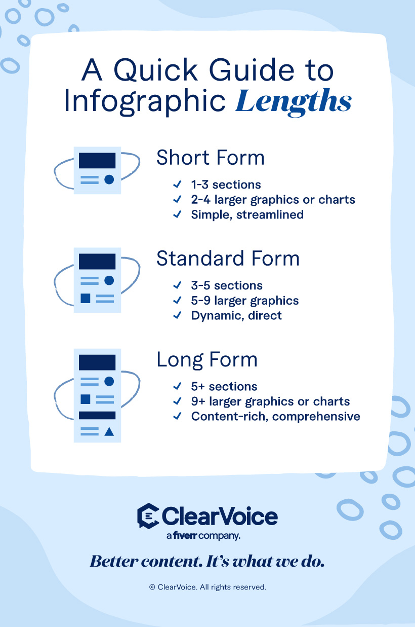
The Long and Short of It
Here’s a quick breakdown of how to think about infographic lengths (with examples):
- Short Form
- 1-3 sections
- 2-4 larger graphics or charts
- Standard
- 3-5 sections
- 5-9 larger graphics
- Long Form
- 5+ sections
- 9+ larger graphics or charts
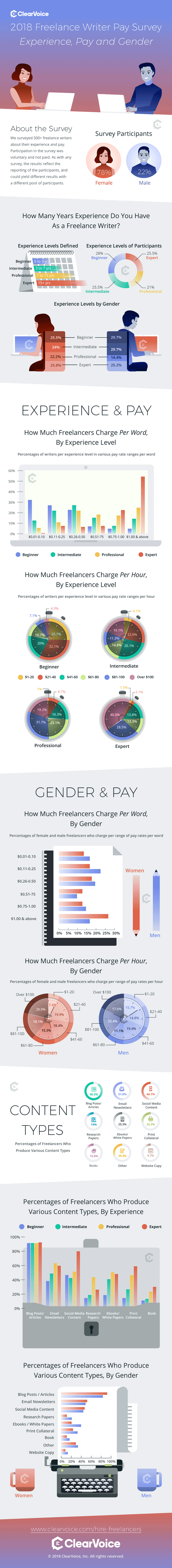
- More content-rich example displaying survey results: Freelance Writer Pay Survey
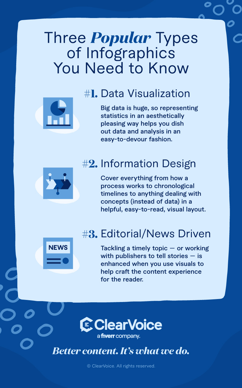
Beyond length, here are three popular thematic types of infographics:
- Data visualization: Big data is huge, so representing statistics in this fashion is an aesthetically pleasing way to dish out data and analysis in an easy-to-devour fashion.
- Information design: This type can cover everything from how a process works to chronological timelines to anything dealing with concepts (instead of data).
- Editorial/news-driven: Most magazines and newspapers have digital editions that meet or surpass print, so tackling a timely topic — or working with publishers to tell these stories in a branded content play — could make sense depending on your story.
What Businesses Use Infographics?
Any business that wants to distill complex information (data, original research, and/or studies) into a digestible and shareable communication device might consider an infographic.
Here are some specific ideas for putting them to use:
- Donors: Sharing fundraising milestones and how money was used
- Incoming students: Giving fast facts on class size, tuition cost, and notable programs
- Employees: Offering new benefit information, along with major enrollment deadline details
- Customers: Giving a step-by-step explanation of how to purchase, return, or exchange items
If it can be said simply, it may be understood better with a graphic. Infographics offer a second way for readers to capture and remember information and may reduce misunderstandings when text-alone information is misinterpreted. This may ultimately result in better customer or audience satisfaction. It’s not only about sales.
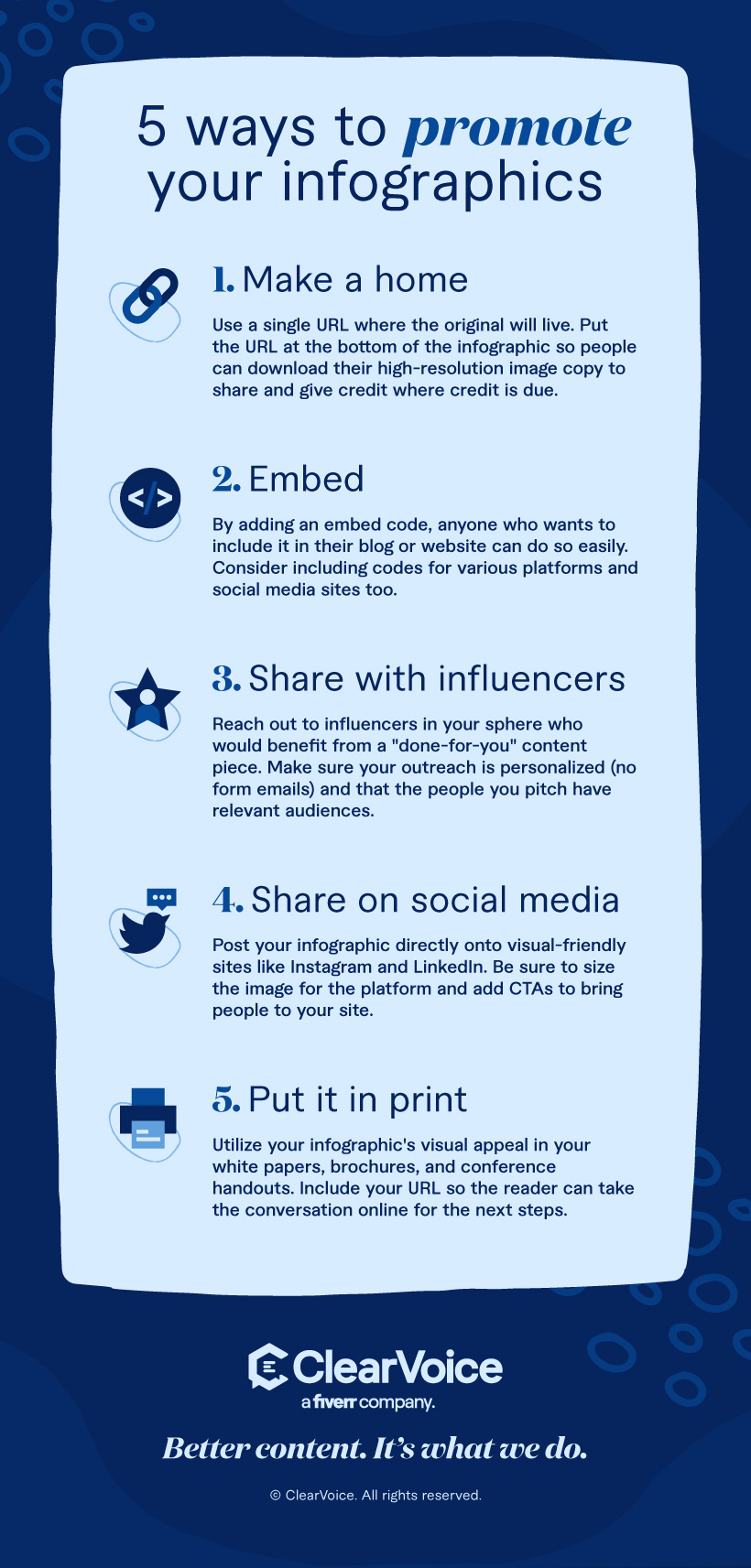
5 Ways to Promote Your Infographics
With your infographic written, mocked up, and proofed, it’s ready to go out into the world. Do you know the first thing to do to make sure others can find it?
1. Make a home
Start by making a single URL where the original will live, and don’t change that location. This URL will be placed at the bottom of the infographic and will tell those who see it where they can go to get their own high-resolution image copy to share. If you don’t include that URL at the bottom, they may not know. Or worse yet, you won’t get credit for your great infographic ideas.
2. Embed
The page your infographic lives on should also have embed code so anyone who wants to include it in their blog posts or websites can.
3. Share with influencers
Influencers love infographics because they help them provide excellent content to their audience without having to do much work at all. By reaching out to those influencers in your sphere who would benefit from a “done for you” content piece, you can help grow your reach. Just be sure you personalize your outreach (no form emails) and be sure the people you pitch have relevant audiences.
4. Share your infographic on social media
Send a link to your infographic out, or post the graphic directly onto visual-friendly places like Instagram and Facebook. If the graphic won’t quite fit within the dimensions of each space, crop out just a section that might draw interest, share it, and let your followers know where they can go to find the rest.
5. Put it in print
Because infographics are already so visually appealing, they make an ideal pick for filling up page space in printed publications. Use them in your white papers, brochures, and conference handouts. Again, put your URL within the same space so you can take the conversation online for the next steps.
Infographic marketing is important since it’s not enough just to make a visual. For every new infographic you create, have a plan for distribution and updating when needed. Get the most out of your hard work with multiple shares across channels, including email.

Keeping Infographics Relevant
Infographics age since the data they share won’t stay current forever. If you’re in a fast-paced industry with many new advances, consider sharing information that can stay current for a year or more. If not, clearly label your infographics with dates so that readers can see — at a glance — if the information is current.
For example, an infographic on the average mortgage interest rate in 2021 would certainly not be relevant now. By clearly titling the infographic to show the age of the data, you can keep your readers informed if they come across the same infographic many years later.
Should You Use an Infographic Generator?
You may see many websites out there promising to give you an instant infographic. While these tools do simplify the process of creating a mockup, they may not give you the level of professionalism and customization you would want in a final product that you would send out to your audience.
Why don’t they make a good substitute? For one, they are too easy to use, resulting in many people using their designs. You don’t want thousands of infographics that look just like yours floating around, do you? If the only thing that differs between your soap company infographic and the one for the local humane society is the color and text, you will certainly run into brand confusion at some point.
Also, these tools generally don’t push you to do your finest work. Your audience deserves the best. After all, you do want to serve them, and making the viewer feel served is part of inspiring them to share. If a viewer can see you didn’t put any work into your infographic, they are not likely to get excited about it and tell their friends. In short, your infographic isn’t shareable if it’s anything but excellent.
Finally, those infographic makers aren’t private, and it’s not always certain how your data is stored or used. Can the tech company that runs it use your infographics on their websites? Do they own the infographic? Since original infographics are considered intellectual property, the maker owns them. You don’t want some other company to own any rights to your work — and that includes infographics.

Ready to Get Started?
With so many benefits, infographics are a solid way to boost your brand footprint and serve an audience, too. If you’ve never done one before, where can you begin?
Some people are DIY with their marketing, and you don’t have to start from scratch to make your first one. It’s easy to find an infographic template these days, and many of the web-based graphic and editing software options, like Canva and PicMonkey, have dozens (if not hundreds) to choose from. With a little patience and some trial and error, you could be making your own infographics in no time.
If you don’t have much time, reaching out to an agency or content partner is the natural first step. Those with experience in infographic creation will already have the tools and won’t be creating new workflows to get the job done. It’s often easy to earn back your return on investment by sharing early and sharing often. Infographics that don’t get shared won’t generate new interest or sales, and this won’t make you feel like hiring out is worth it.
ClearVoice has a team of freelancers well-versed in creating infographics and other high-engaging visuals. Easily talk to a content specialist.


