 In 2009, I had the privilege of working with Net Nanny, the leading parental internet control software, to optimize their website. This was well before conversion rate optimization was a hot topic, and in a time where you didn’t have Optimizely or the dozens of other software solutions to help you test your website. In fact, A/B testing your content as we know it today was a relatively new topic that most marketers knew nothing about.
As I made changes, I was able to track the improvement via Google Analytics. Net Nanny was also leveraging five or six other marketing tools and channels, and each one had its own reporting suite that you had to log into if you wanted to see how that given channel worked.
Oh, how things have changed!
Today we have a much greater variety of software available to us. According to research done by the Winterberry Group, the average marketing team is using over 12 different software solutions to do their job. If you think about a company as a whole — not limited to just marketing teams — there are dozens of different software tools being used.
Hence, the rise of business intelligence (BI) tools. In an effort to help companies make sense of all the data and analytics available from the wide variety of software tools being used, a few dozen BI providers have popped up. You’ve likely seen names like Tableau, Domo, Yellowfin, Grow and Chartio.
I have experience working with each of these software solutions. Each has some pros and cons. For the purpose of this article though, I’ll be focusing on only three of these solutions — the three that are most useful for the average small or medium-sized marketing team — Yellowfin, Grow and Chartio.
Why not look at Tableau and Domo?
These tools aren’t the best solution for marketing teams that need quick, powerful and affordable solutions for displaying aggregate data in easy to use dashboards. Don’t get me wrong… I think Tableau and Domo are both strong solutions in their own avenues.
In fact, of the different BI charting/dashboarding solutions I’ve used, Tableau is by far the most powerful at deep data analysis and attractive charting. It’s also quite affordable too. However, it’s not as easy to use as the three solutions I’m going to be covering. It also is really good at graphically presenting a single data set, but not so much for dashboards where you have multiple data sets in one place. They are putting more emphasis into dashboard enablement, but it still isn’t their strong point.
Domo is by far the best-marketed solution of all these BI dashboarding tools. Josh James, one of the key founders that brought Omniture SiteCatalyst (now Adobe Analytics) into the world is going at it again with Domo. Josh is marketing Domo very heavily. While it’s a good solution that I think holds its ground with Yellowfin, Grow and Chartio, it costs considerably more than these other solutions. I’m talking 3x+ more than the competitors. Josh has grand dreams for Domo, so you’re paying a premium for it as the software matures.
Getting your most important marketing KPIs in one place
Gone are the days of marketing where you created an advertising campaign, pitched it to the company, and then purchased media to get it out there. Today’s marketers have a much more complex and involved job, and have to prove their marketing spend at each junction of their efforts. Marketing key performance indicators (KPIs) have never been so important.
As a marketing leader, you’ve likely become tired of having to pull up a dozen different reports each day/week/month to run your reports. That’s why a number of companies have popped up that tie in each of your data sources and show all the charts, graphs and data tables in one place: your very own dedicated BI dashboard.

While there are a few dozen BI dashboarding solutions available to you, in this article, I review what I consider to be the three best players in the space: Grow, Chartio and Yellowfin.
Judging process
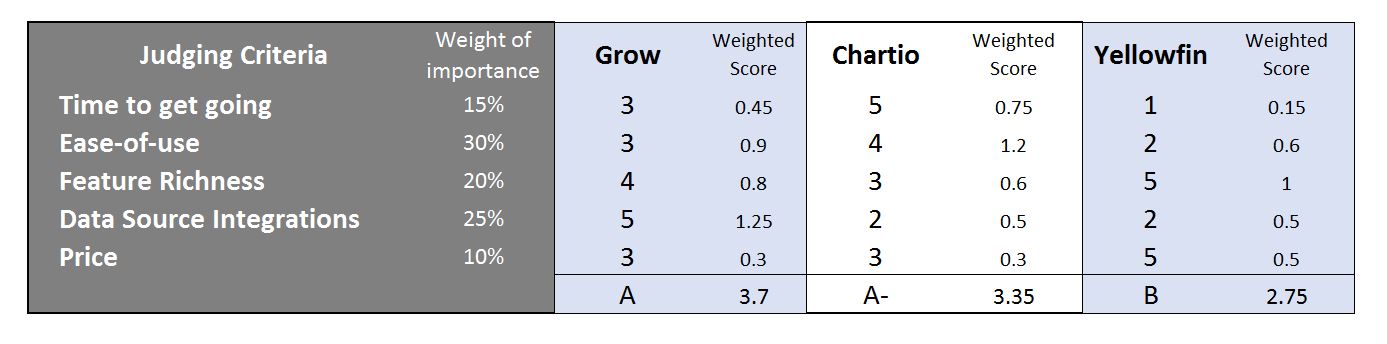
I have no personal stake in any of these companies. To treat them in a fair, non-biased fashion, I will be judging them all on the same criteria:
- Time to get going. How hard is it to get started with the tool? Do they have training, tool tips, or videos to help you learn what you’re doing?
- Overall ease-of-use. How good is their user interface? How easy is it to use?
- Feature richness. Does the solution have features that make it stand out from the competitors?
- The depth of integration. How easy is it to integrate with your data sources? Can you accurately pull in information without too much work?
- Price. How much does it cost?
At the end of the article, you can see the grading rubric with the specific criteria weighting that I’ve used. I’ll also assign an “overall winner” to one of these three solutions.
Grow
Getting into Grow the first time, you’ll notice the clean and minimalist nature of the solution. Visually modeling your marketing data can be a scary task, especially since most marketers have been trying to leverage Microsoft Excel for the data reporting needs. Grow makes it so much easier, though. It is also much more flexible and powerful than Excel.
Grow Strengths:
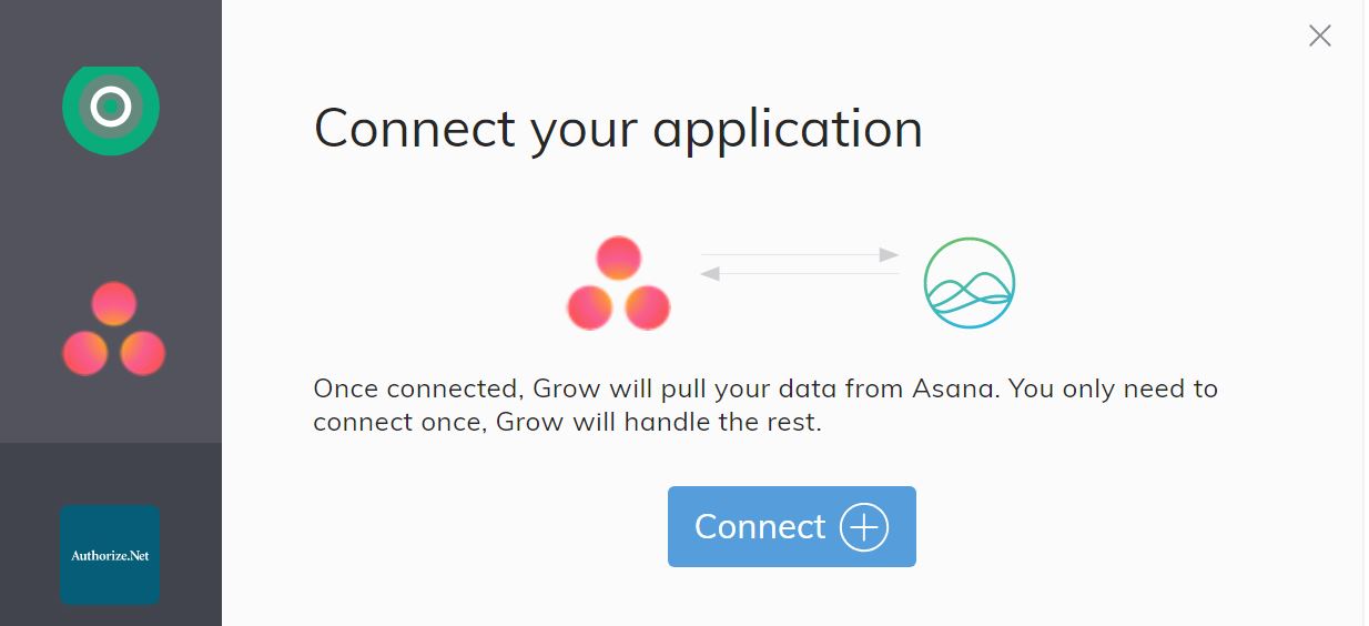
- Native integrations. One area where Grow really shines is in their data integrations. The whole point of a business intelligence dashboarding tool is to be able to easily pull in data from multiple sources and then graphically represent that data in easy-to-view reports/dashboards. Grow makes this easy, via direct integrations with all the most popular marketing tools: MailChimp, Marketo, Salesforce, Asana, Google Analytics and dozens more. What makes Grow nice is that wherever possible they have integrated natively, meaning you don’t need to set up special API connections. Instead, you simply click the “Connect” button, and it brings up the login box for whatever tool you are connecting. After putting in your login details, you give your permission and the data starts to flow. Voila!
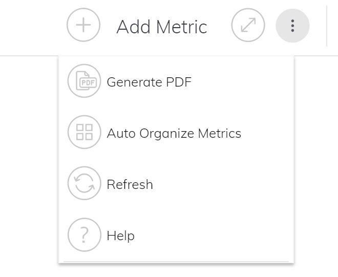
- Nice little touches. The team building Grow is obviously building their tool with clutter-free simplicity in mind. For example, one of many nice little touches they’ve added to their user interface is an “auto organize metrics” option for dashboard layouts. You simply click into your menu and select this option, and the visual representation of your marketing data is laid out nicely in front of you.
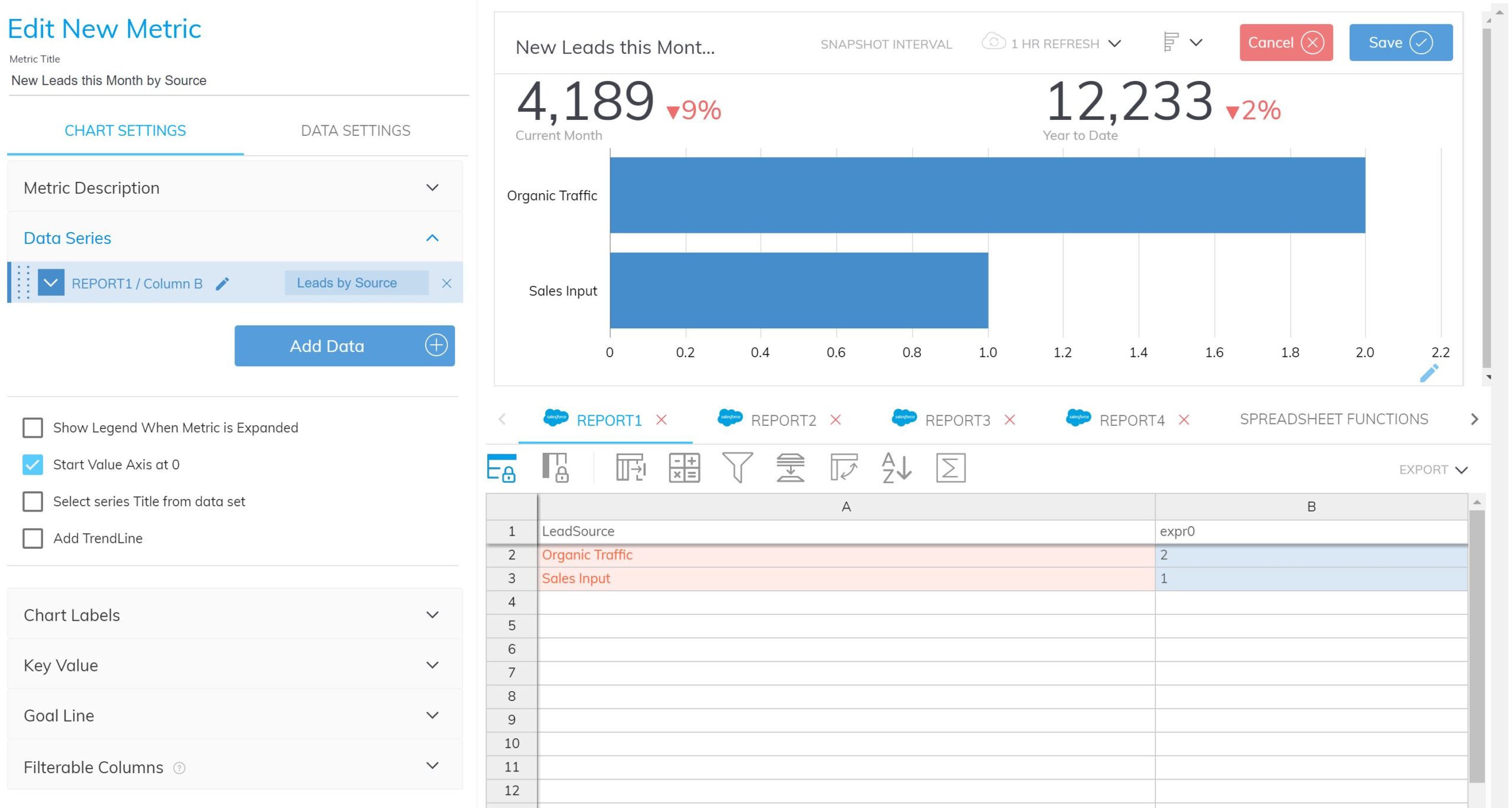
- Most advanced component builder. Of the three tools reviewed here, Grow has the most robust component builder. You can click and drag data into the builder, or you can get deeper into the data representations with SQL.
- Data tables. When you are creating the actual data visualizations, you are shown a table with the data that is being pulled in. This is very helpful when you’re trying to visualize more complex data sets.
Grow Weaknesses:
- Still an immature user interface. While Grow seems very polished and clean, I occasionally run into little user interface bugs that make me wonder how mature this solution really is. For example, when creating a new metric, after selecting the data source on the left panel, you are shown some out-of-the-box metrics that are available to you in the right panel. The problem is, the right-most metric is always flowing off the screen. There is no horizontal scroll bar on the UX, so I can’t scroll over there to click the button. If I want to actually use that metric, I need to open up the Chrome “Inspect Element” tool and make some CSS alterations — a task that most marketers won’t be able to do.
- Learning curve. Unlike Chartio, which is super easy to use and boasts a wealth of onboarding helps, Grow has a little bit more of a learning curve. When you go into the metric editor, you have a lot of options. Do I think they should take the options out or simplify further? No. It would be nice if they had more ready help on the metric editor page (instead of having to click out into their “university” pages), but I don’t think they should cut any of these options out. Their solution is more robust than most, and they shouldn’t take any of that away. Just be warned, that if you are a new user of BI visualization tools you will need to spend a little more time to get the hang of Grow.
Pricing
Starts around $600/team/month. They don’t list their prices online, but you can get a quote relatively easily.
Grade
A (3.7 out of 5 possible points)
Chartio
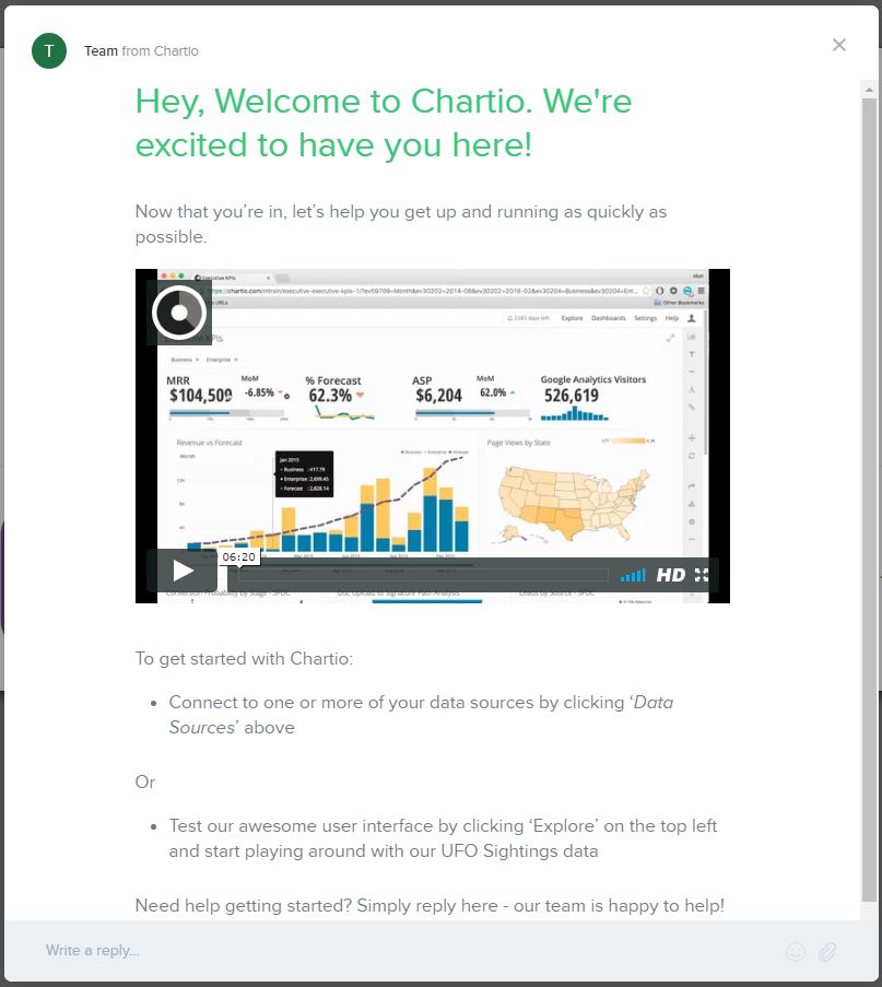
When you first setup Chartio (which is super easy, btw), you are presented with a wealth of onboarding help, from a quick training video to pop-up training prompts on many of the pages. They also have sample data sets already loaded into Chartio that makes getting started with the component building a breeze. Overall, the Chartio is a joy to work with.
Chartio Strengths:
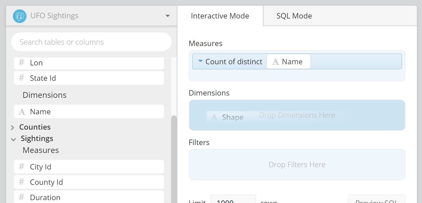
- Onboarding. When you first log into the tool, you are presented with a dialog box with some getting started instructions and a great video that gives you a great overview of the tool. They also have the tool preset with “UFO Sightings” sample data you can use to start building right away, even if you haven’t connected to any data sets yet.
- Simple or complex. Chartio allows you to build data visualizations simply, similar to the point-and-click chart builders in Excel, or do more complex data visualizations with SQL statements. Their component builder is so easy to use that you really don’t need any previous training to get started. You simply click and drag components into the measures, dimensions or filters you’d like in your visualization.
- Documentation and help resources. In addition to excellent upfront onboarding, once you are into the tool, if you still need help with setup they have an expansive but easy to walk through setup guide that is broken into small modules (tasks) you can do to get everything going. You can also watch a number of well-put-together tutorial videos, read through the industry standard documentation pages, or consult other users in the community forums.
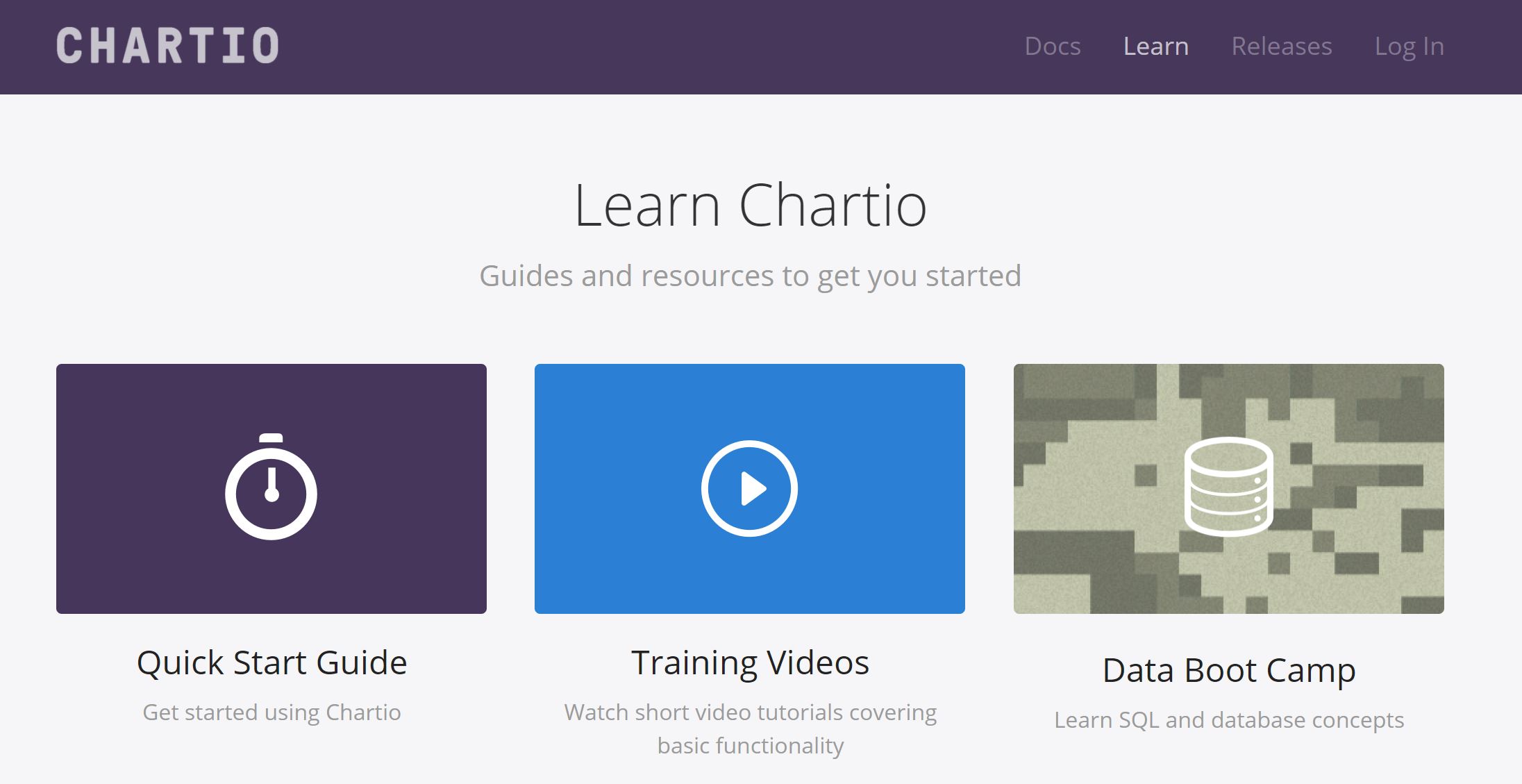
- Data Bootcamp. If you are new to data analysis, the dedicated microsite for the Chartio Data Bootcamp has four modules to get you started. The bootcamp has a series of modules to train you on the basics of data analysis, and then it shows you how to launch the sample data in your new account. There are also exercise sets where the bootcamp presents a question (that you should be able to answer by clicking through your Chartio sample data) and then it has explanations on how to solve each question.
Chartio Weaknesses:
- Lack of natively Integrated Data Sources. If you’re a marketer who wants to add your data sources without tying up developer resources, then Chartio falls a little flat. While most of the competitors have dozens of natively integrated data sources that are super easy to setup, Chartio has a lot of database connectivity options, but only one SaaS solution direct connection: Google Analytics. Granted, Google Analytics was probably the wisest choice for their first direct connection, as it is so widely used in marketing… but it’s sad to not see a wider variety of marketing solutions available here. In chatting with a support representative at Chartio, they explained that to connect to services like Marketo or Salesforce, you should first connect that tool to a third-party relational database platform that Chartio integrates with, and after housing the data there you can easily pull it into Chartio. Problem is, marketers aren’t generally developers, and getting all this setup can be overly burdensome.
- Dashboard component overlapping. To build your marketing KPI dashboard, you can click and drag charts, graphs, maps, tables, etc., into the section where you would like it to live on the dashboard. The process is relatively easy. So… why do I consider this a weakness? When altering the dashboard, or adding new items to it, if you drag a new component into the area where you want it, the current component that lives there doesn’t auto-slide down to make room for the new component. The new component will actually be placed on top of it, and when you render the live dashboard, you’ll see the two components overlapping. It’s not a huge weakness, but kind of annoying when you have a big dashboard and have to move all the components down manually to make room for a new one.
Pricing
Starts at $199/user/month if paid annually, and if 4+ editor seats purchased.
Grade
A – (3.35 out of 5 possible points)
Yellowfin
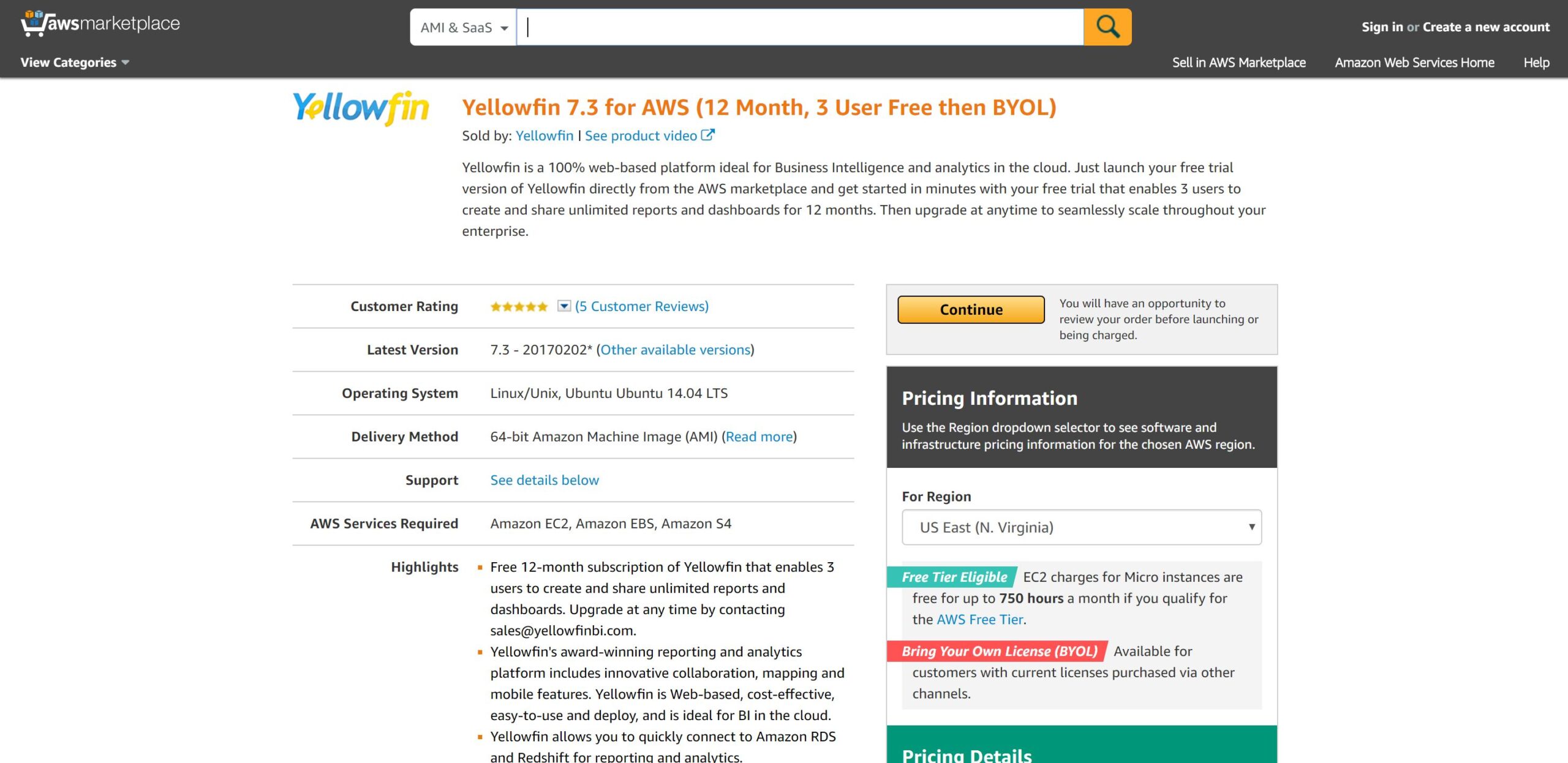
Yellowfin isn’t your typical marketing KPI visualization solution. It’s very robust and targets larger-sized businesses. In fact, before you can use it, you need to launch it on your own server — something seen as frightening by marketers and enviable by developers. Why have I included it in this comparison then, when Grow and Chartio are so much easier to get started with? Because Yellowfin is a powerful tool that is also more affordable, especially if your marketing team has an in-house IT member that can dote on your every need.
Yellowfin Strengths:
- Most powerful. Because Yellowfin is self-hosted, they expect organizations using their software to be larger and more advanced. Thus, they’ve also made their solution more robust. For example, if you see questions in a data set, you can create and assign tasks from within the software to make sure the right person is aware and looking into your question.
- Interactive presentations. With Yellowfin you can create interactive presentations that you can use when presenting your data. Think PowerPoint on steroids. Storyboard allows you to put your data into a presentation format that you can present from a projector, or share to an executive’s mobile device.
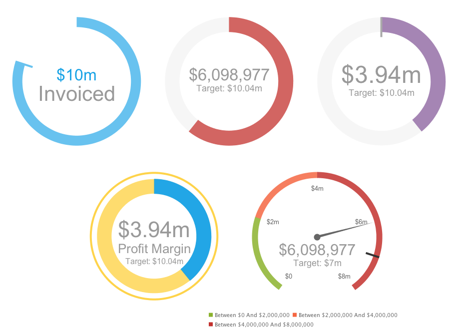
- More customizable graph types. Because of the robust nature of Yellowfin, it also boasts the greatest selection of ways to present your data. Take for example the below screenshot, which shows you the selection of dial and meter charts that are available to you as a marketer. It’s important to note that each of these charts can be customized in many different ways.
Yellowfin Weaknesses:
- Support. Some of the strengths of Yellowfin, such as the flexibility around hosting their solution on your own servers, also lead to a confusion of version control. There are enough old versions of their software floating around, and their company has been changing the solution so rapidly, that it often feels like their support staff is relying on old product documentation to help you troubleshoot your problems. This can be frustrating.
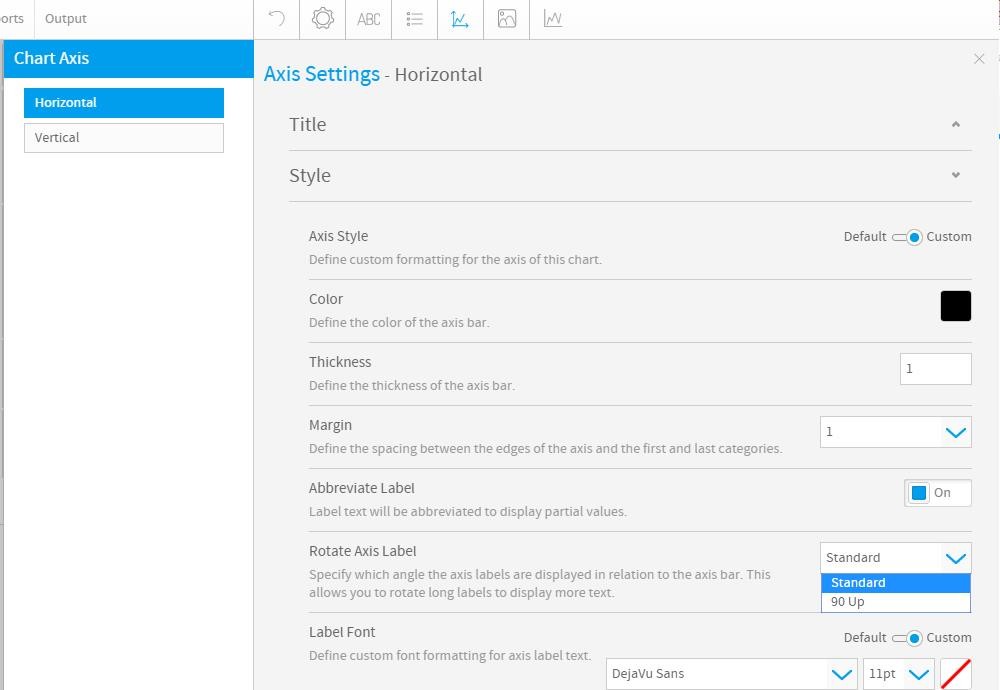
- Not as polished. Because this solution, for the longest time, was marketed towards developers that wanted full control of the BI solution, not a lot of thought went into the design aesthetics and ease-of-use of the tool. Yellowfin has been doing a good job of changing that, but it’s a big task that they still don’t have down yet. For example, setting up a chart requires reading through dozens of options (see below screenshot) and hoping you know what each does. I’ve found myself toggling one item, looking at the chart to see if the desired effect occurred, and then going back to the settings to un-toggle and toggle something else instead. Somewhat frustrating.
- Requires IT to launch and maintain. Some organizations still don’t trust cloud-hosted solutions. For many of these organizations, controlling all their data is important because of the industry they are in (finance, insurance, healthcare, etc)… but some organizations simply don’t trust the cloud. If you’re in one of these organizations, then Yellowfin is for you. You can host it on your own internal server, or launch it to a server with Amazon or other server providers. However, for most marketers, this is an unnecessary burden that requires involving IT. Yellowfin is built for self-deployment, which I see as a considerable weakness.
Pricing
Starts at $30/user/month if paid annually. You’re paying $1750/year for 5 seats.
Grade
B (2.75 out of 5 possible points)
The grading criteria and rubric
Interested in seeing the math behind the grades?
I made no effort to try and get the scores close to one another. I graded them as I went, and put down each grade independently of each other. It turns out that Grow and Chartio are neck-and-neck, though I consider Grow the winner because of the vast selection of data sources and the robust feature set.
Here’s how I’ve calculated the scores:
Who should use Yellowfin?
If you are a larger organization that needs to keep your data on your own in-house servers, then Yellowfin may be your best bet. It takes longer to get set up and isn’t as easy to use, but it is the most powerful of all the solutions.
Who should use Chartio?
Chartio is an excellent marketing business intelligence solution. It is the easiest to get started with and the easiest to use all around. What it lacks in the data source integrations can be made up for if you have a few good developers to help you get started. It isn’t as robust in the way you can cut up your data as the other two solutions, though, so I’d recommend it to smaller companies with less stringent reporting requirements.
Who should use Grow?
Grow is great. It has the best data source integrations available and is very robust in what you can do with your data. While the documentation and onboarding help, they aren’t as good as those offered by Chartio. If you have a little more time to get started, I think you’ll be pleased by the extra functionality. I’d recommend Grow to medium-sized businesses.